

Introduction
Charcoalblue is a global design consultancy, creating amazing spaces where stories are told and music is made.
Their work primarily involves large building/space design projects covering Venues, Culture, and Workplaces. They have been involved with the new Bristol Old Vic and the newly renovated Colston Hall.
CharcoalBlue has been involved in designing Google's new offices in Kings Cross, including the design and specification of each meeting room. Through this work, they were introduced to Google’s Meeting Room Hardware team.
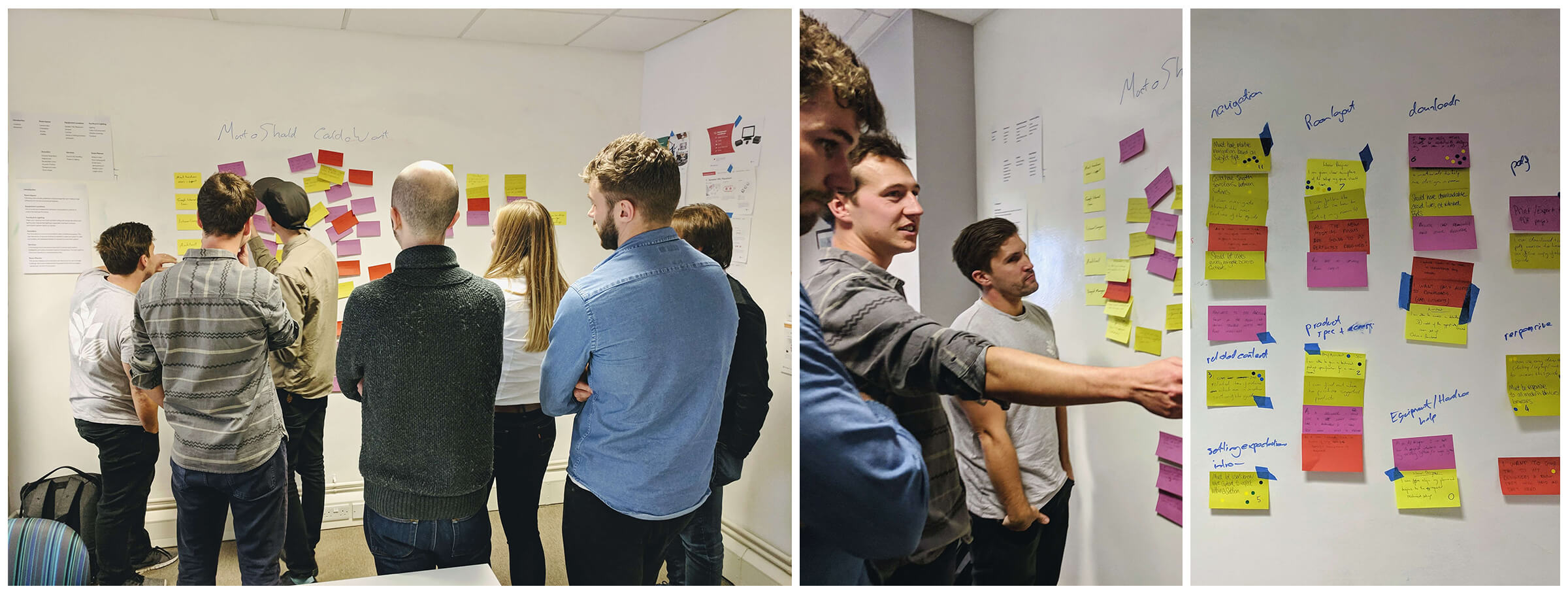 Idea generation & requirements prioritisation workshop
Google’s Meeting Room Hardware team creates and sells a range of hardware to businesses to enhance collaborative working. Users of this hardware would often struggle to achieve optimum performance and blamed Google’s hardware. It was soon discovered that the weak point would often be users physical spaces and setups. Google and Charcoalblue proceeded to create a set of room design guidelines as a static PDF.
At this point I and the team got involved, tasked building an engaging tool to aid customers in setting up the perfect meeting room.
What we delivered
From the discovery phase, we understood this product would have 2 types of users to serve.
I want to know what equipment I should purchase
The Guide should provide confidence that purchasing Google's hardware will solve their problems. By providing a service that doesn’t stop once the hardware has been delivered, providing guidance for the spaces around the hardware, their offering is a much better investment for businesses.
I need help adjusting the equipment and spaces I have
FAQ style help may reduce a fraction of support calls, but presenting help in an interactive format that represents the users' physical space is far more helpful. The representation of this physicality makes solutions easier to understand and action, resulting in less time spent troubleshooting and a reduction in support calls.
If a user has a specific issue or question they can jump to that subject section, then into a sub-section. Once here, the focus is on 1 card at a time which related to the 3D model or image being displayed. This single point of focus is ideal for users trying to digest this type of content.
The Guide was built with Angular for structure & functionality and Three.js for displaying 3D models. This technology choice was purposeful for the experience of journeying through the Guide to feel seamless and instant. We wanted to present content in bitesize chunks so it’s not overwhelming, while also presenting everything within easy access at any point in the user journey through the Guide.
The Room Planner asks users how many people they need in their meeting room, then details physical, service and equipment requirements. Before purchasing expensive equipment, users understand what kit they need and where to optimally position it. This reduces overspend for business and provides the purchaser confidence in Google’s products.
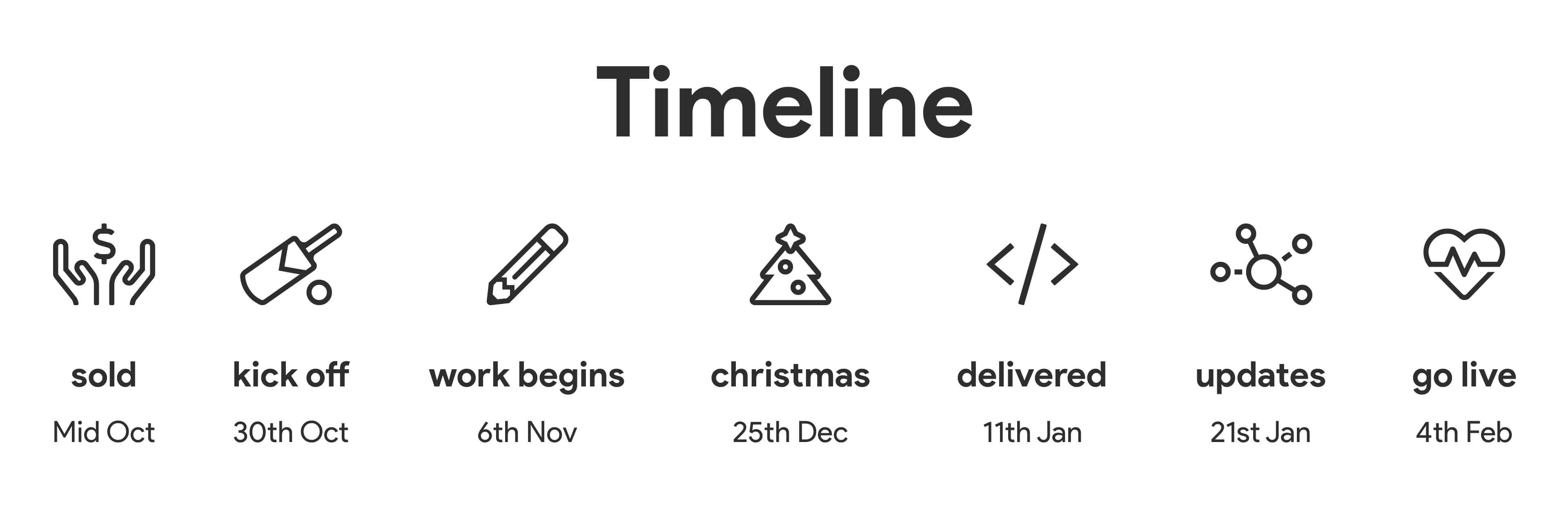 The tight delivery timeline we were set
Workflow Principles
I felt this was an ideal project to advance the teams Agile processes and how Design & Development work together. On previous projects, I felt development would often start too late, often only once all designs had been completed and signed off. From the start, I introduced 4 principles to the heart of our workflow:
Design alongside Development.
Development began as soon as the structure and content models had been decided. We built the scaffolding of the web app before any designs were signed. The other main benefit of this is both design and development understand each other's decisions, working together to balance trade-offs.
Use Design systems.
With the nature of the content being room layouts, we decided early on to use 3D models in our app. Knowing this would be challenging and likely time consuming, we had to streamline time elsewhere. We didn’t need to design everything from scratch as we could use Google’s Material Design system. This saved us time as we could focus more on the structure than the foundations.
Make time for Design QA.
Design can often be overlooked in the QA stage and design issues not raised until it’s too late. We built-in time for designers to Design QA tickets before they moved to QA. They couldn’t hold up a ticket till it was pixel perfect but were able to catch design defects in a good time.
Don’t build the cool shit first.
The cool part of the project is always the bit everyone can’t wait to work on. In our case, if we prioritised all the 3D modeling and tweening first we wouldn’t have a functional product to release. I broke down every requirement and prioritised accordingly: we would build the minimum structure and features for a user to perform their tasks. Then build out from this.
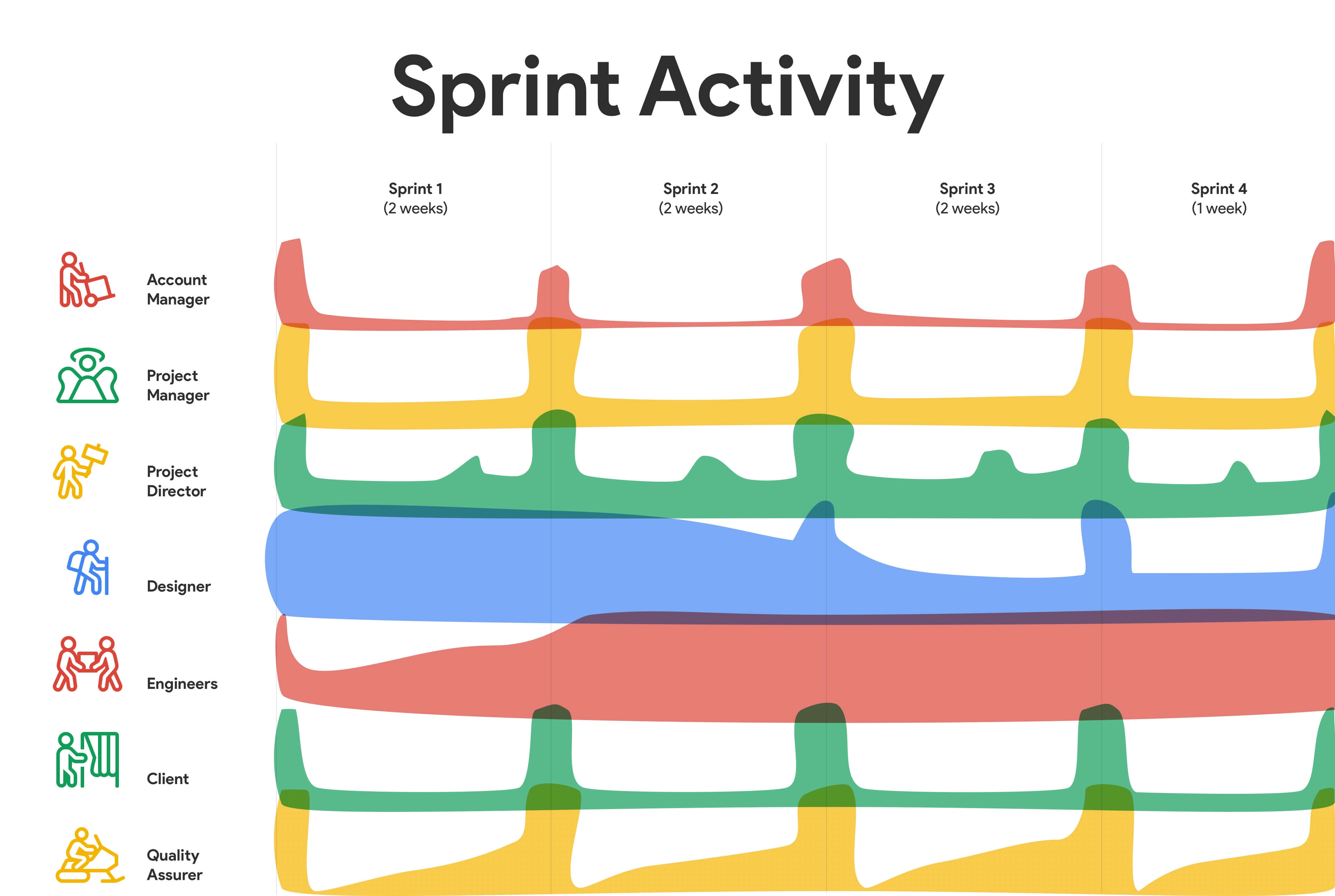 The teams activity during the project
by Gareth Williams
I pride myself on empowering teams to turn complex problems into simple and engaging experiences, through a multidisciplinary skill set and 10+ years of industry experience. If you'd like to chat please get in touch.
