
- project
Glamour Articles, Home and Navigation
- my role
Information Architect
- completed
August 2013
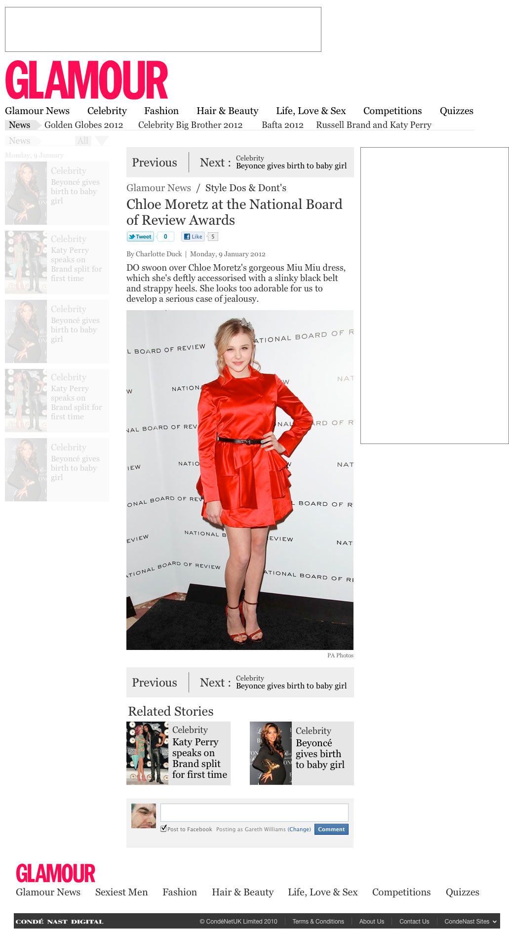
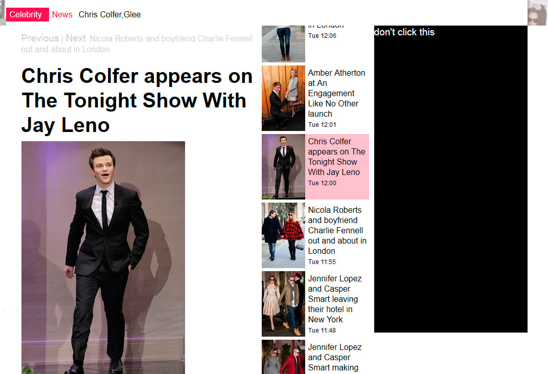
What we launched
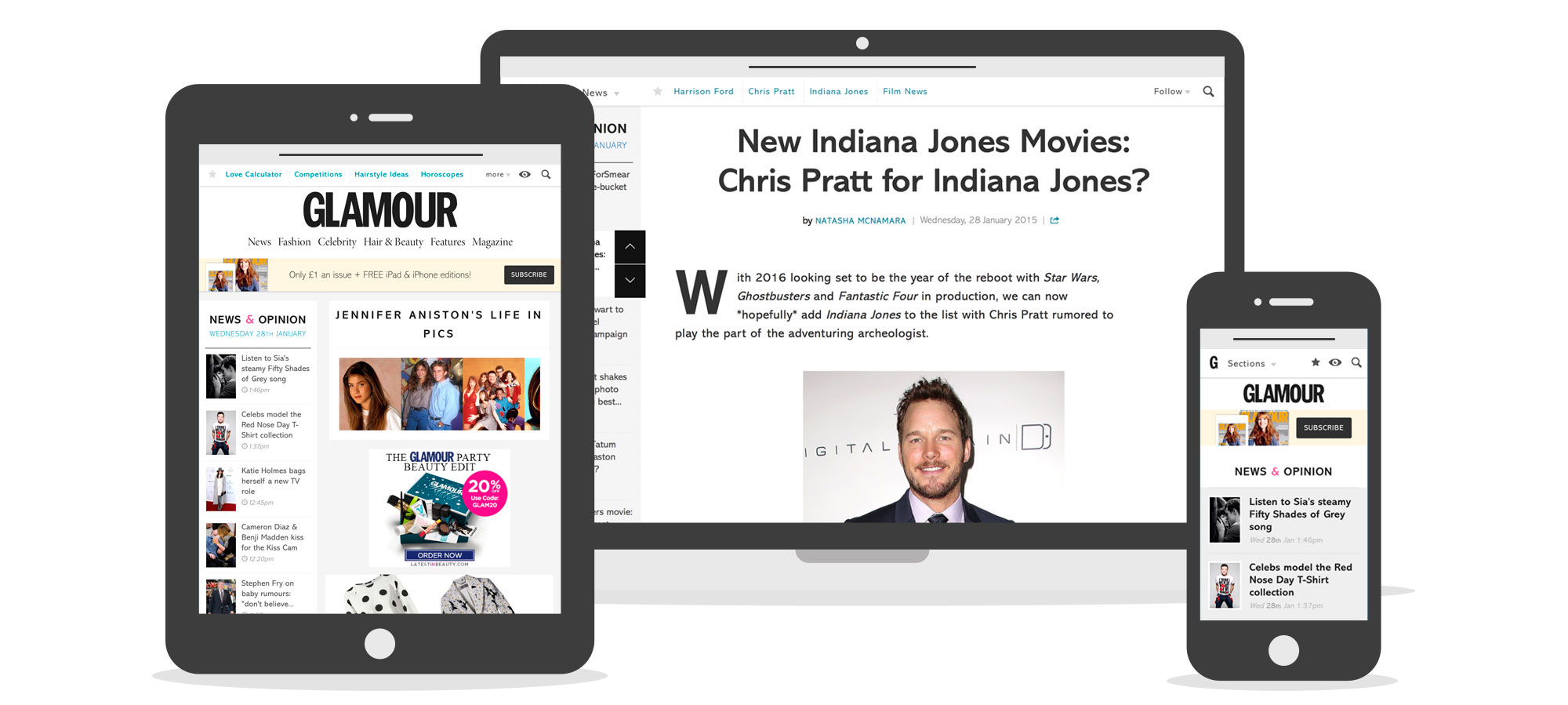 Screenshots of live site across different devices
Live Glamourmagazine.co.uk links
My role in the project
With this project we wanted to clean up Glamour and improve navigation around the site. There was a lot of hidden content buckets we wanted to unearth. We also created an article news section. It involved big changes, by only designing two multi functioning templates. I was the Information Architect on this project, responsible for research, project concept, site architecture and working with the design and development teams to implementing the product designs.
Navigation
Glamour had a lot of sections it was confusing to know where to find what you were looking for. To find out how popular the section list pages were I analysed the pageviews of just the list pages, excluding the article/gallery contents within the sections.
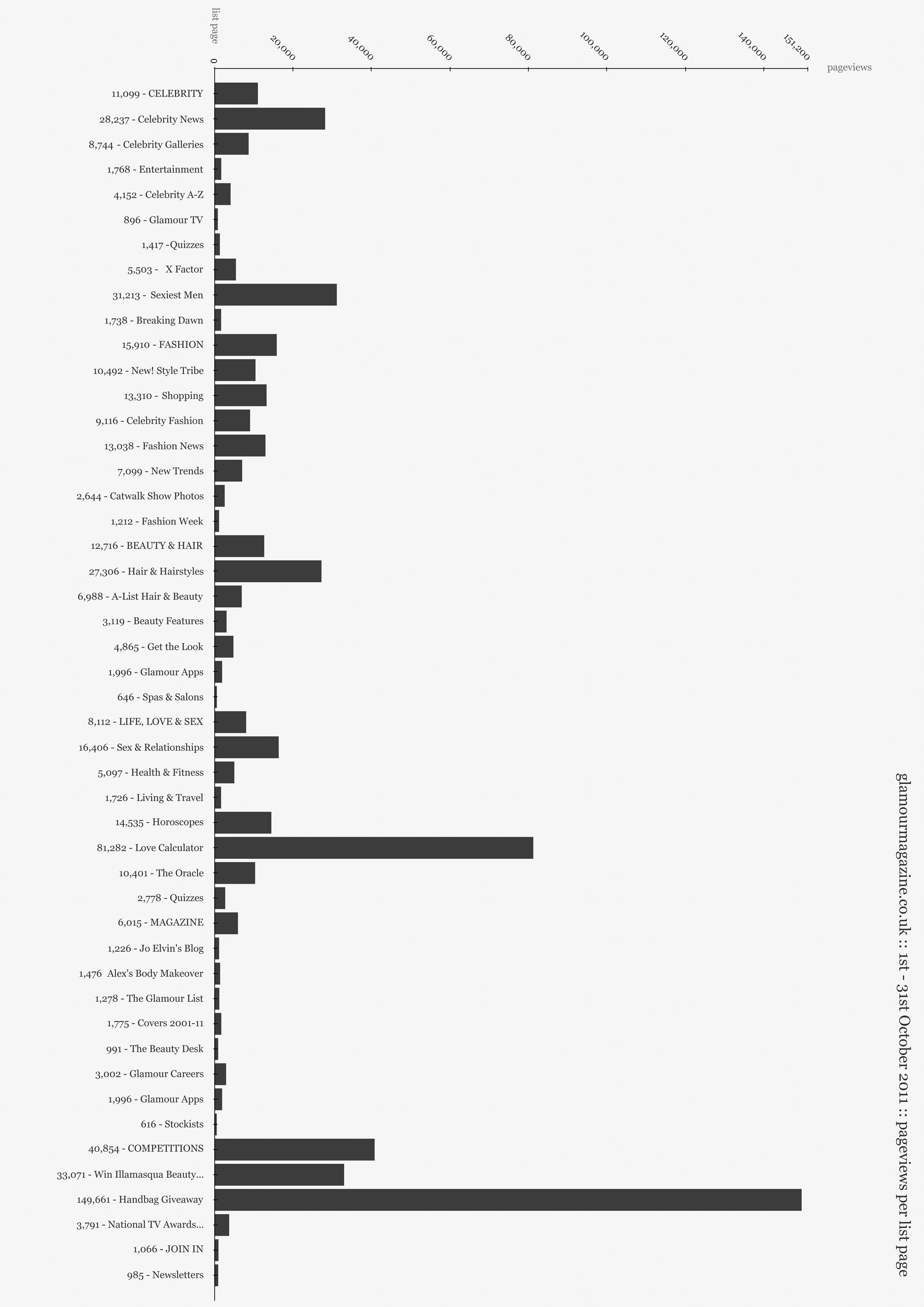 Popularity of Glamours list pages, helped us work which to cut and combine
With the editors I ran a card sorting workshop. We took a fresh look at the site sections, their editorial purpose and how the navigation is grouped.
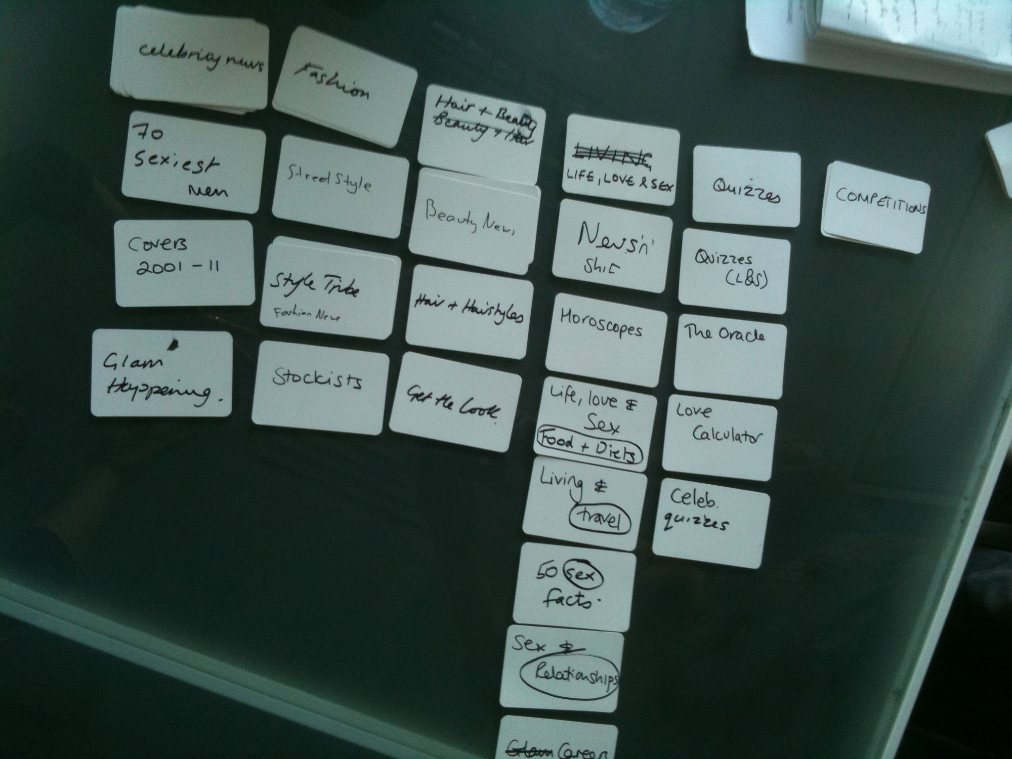 The final grouping of sub-sections and top level navigation, from card sorting workshop
Home and List Pages
Through Google Analytics custom Events, I recorded the browser viewport sizes of every user on Glamour. Making this data visual helped the whole team gain an understanding of just how varied our users screen sizes are.
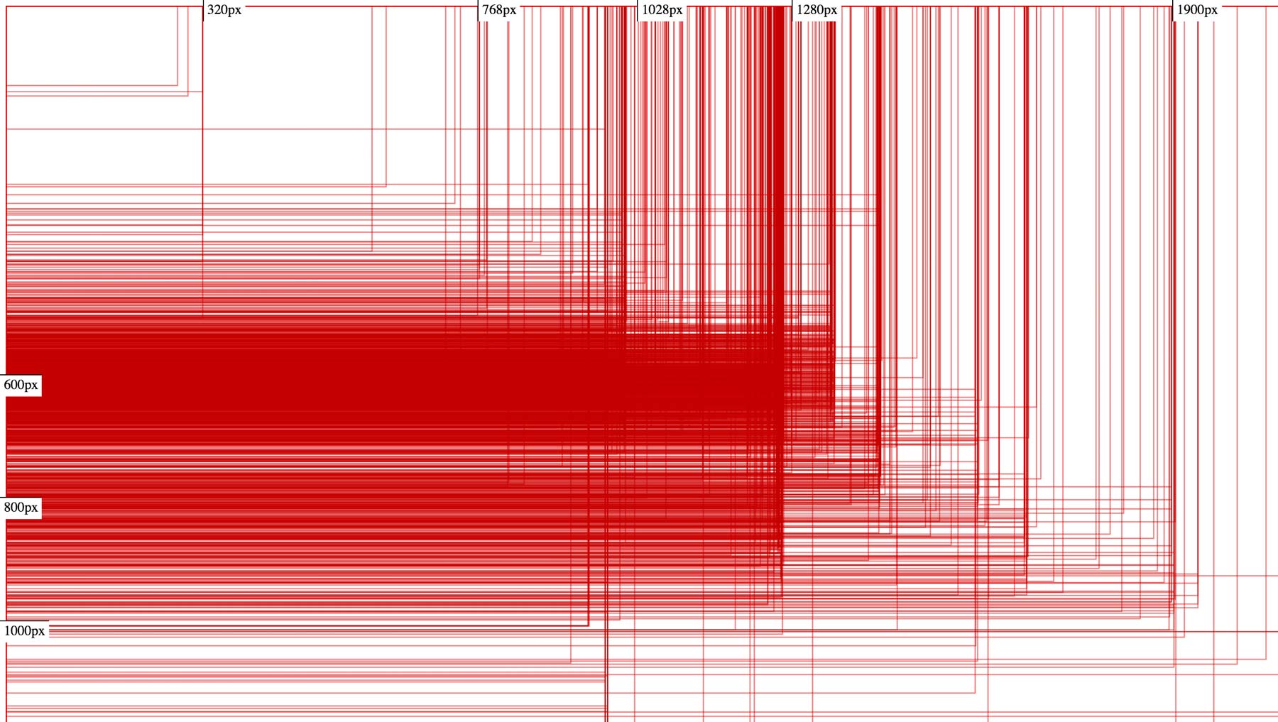 Visualisation of users browser viewport sizes who visiting Glamour
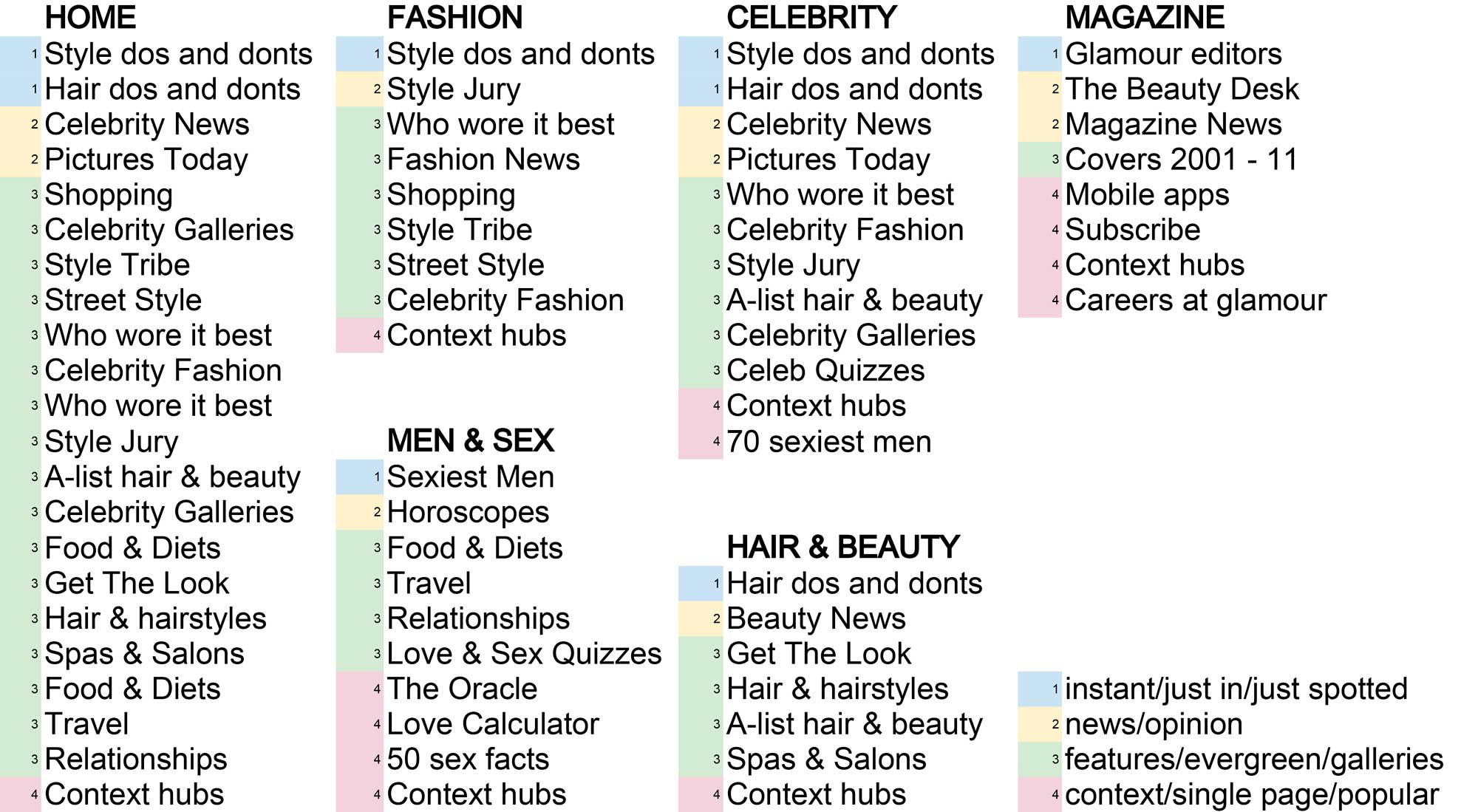
To better surface content on the list pages I split the list pages into four areas,
- instant/just in/just spotted
- news/opinion
- features/evergreen/galleries
- context/single page/popular
These areas are populated with content from specific sub-sections. There was a lot of restructuring to do in the sections and sub-sections. Various teams needed to know what this looked like.
 Navigation and structure showing which old sections made up new section list pages
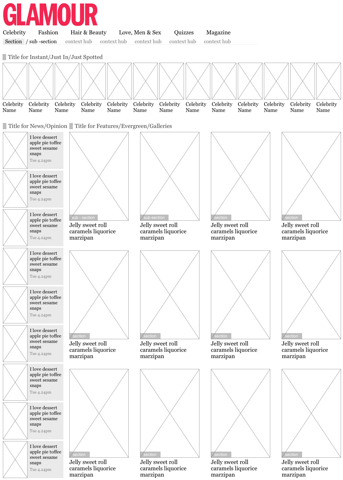 Wireframe of home page, showing the layout of the four areas and their hierarchy
Before moving forward with the new section list pages we needed to test the data. We built a prototype using a copy of the live database, there was very positive results. We tested this prototype with people and found that even in prototype form it was far easier to find content and to understand the different types of articles/galleries.
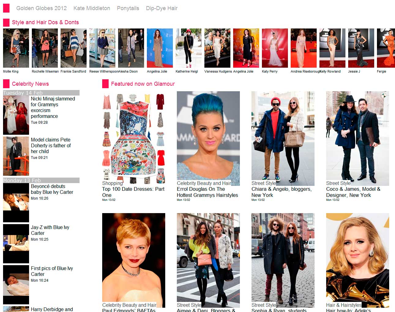 Screen grab of the Glamour prototype Homepage
Fortunately Glamour editors had been actively tagging their content. Testing out Topic Hubs returned fantastic results.
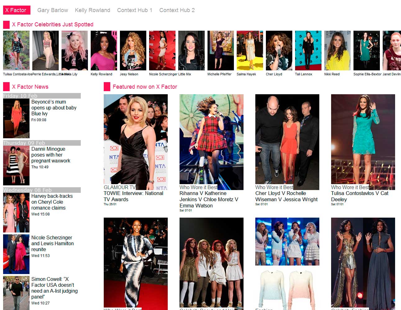 Screen grab of the Glamour prototype Topic Hub, using X Factor as a test case
Article
The main focuses for the articles were to improve navigation from article to article and from article to section. At the top of the article are topics that relate to the current article, this gives users a clear way to find similar content. On the left side is an article navigation, showing items from that sections list page, to easily read through a sections articles.
 Wireframe for an article, showing its layout, article navigation bar and article topics
Though the idea was great in concept and wireframe, I needed to test it with real data to see how viable it was. Topics per article accurately represented what the article was about and navigating through articles was seamless.
 Screen grab of the Glamour prototype Article
Advertising
The new templates had to support current advertising formats, such as a Leaderboard, Double Sky and MPU. At the same time it had to rearrange to fit our in house Responsive format.
These diagrams were used to communicate the advertising options to internal Sales, Ad ops, Management, Design and Dev teams and externally to brands.
Check out the Condé Nast Responsive ad builder
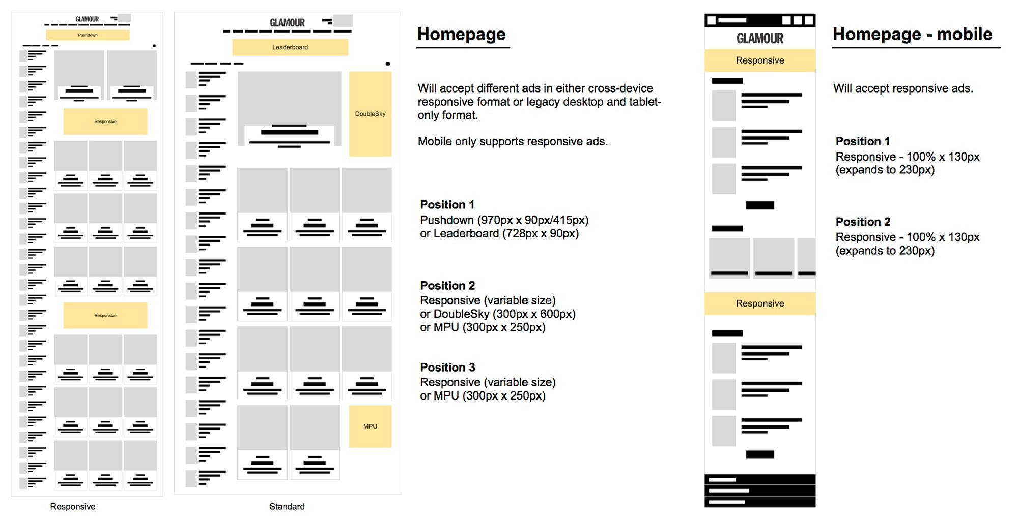 Advertising specifications for Glamour Homepage on Desktop and Mobile
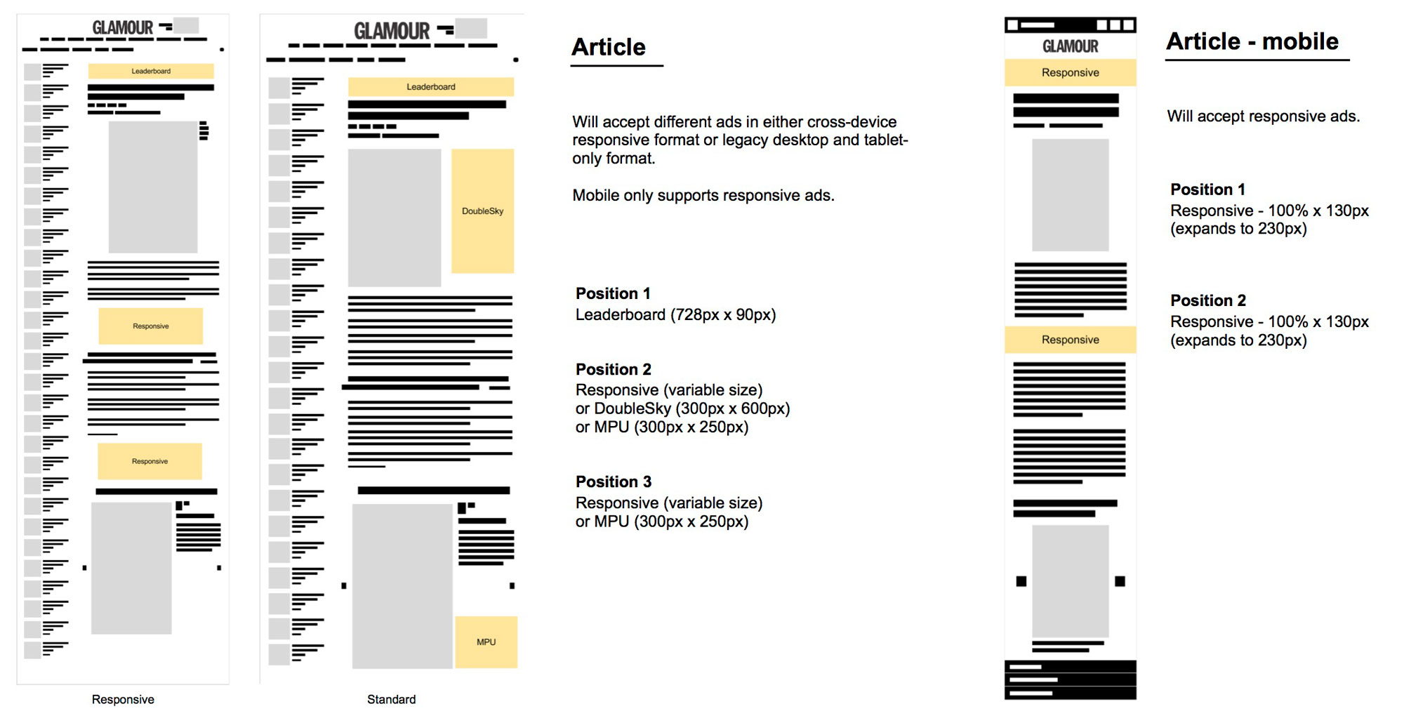 Advertising specifications for Glamour Articles on Desktop and Mobile
by Gareth Williams
I pride myself on empowering teams to turn complex problems into simple and engaging experiences, through a multidisciplinary skill set and 10+ years of industry experience. If you'd like to chat please get in touch.