
What we launched
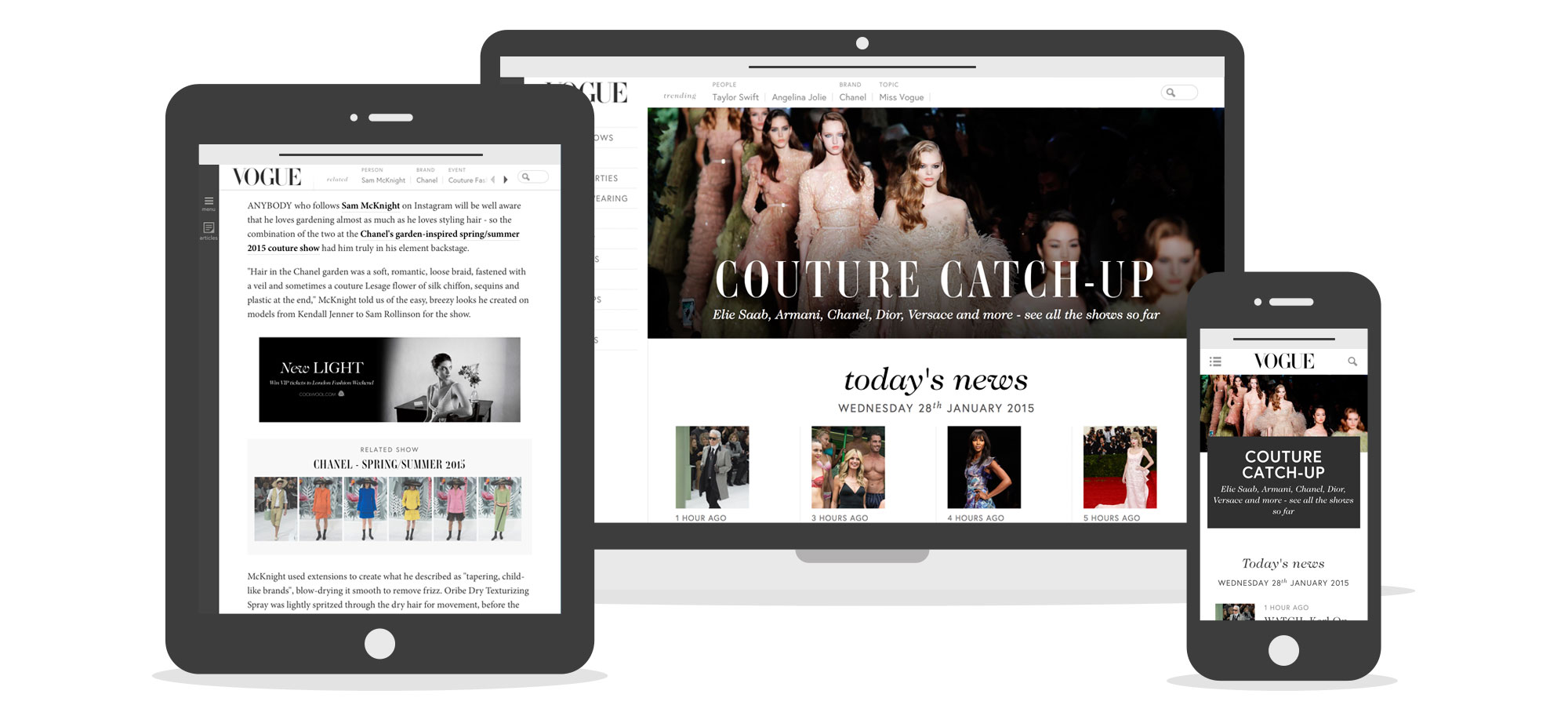 Screenshots of the launched Vogue.co.uk across different devices
Live Vogue.co.uk links
My role on the project
On this project I was the Information Architect. I was responsible for research, concept development and the UX deliverables such as Wireframes, Prototypes and Specifications. The team was made up of me, 3 Designers, 3 Developers, 2 Project Managers, 4 Online Editors and input from the Sales and Print Magazine teams. The project lasted about 8 months.
Project Goals
Our goal was to take one of the oldest print magazine titles and redesign it’s aging site; bringing it into the digital modern day. The new site had to be engaging, different, stylish, beyond fashion and simple to use.
More clearly defined goals were,
- New Commercial positions (homepage sponsorship)
- Increase page/visit
- Simplified navigation structure for users
- Simplify editorial experience
Being a very well known fashion magazine, Vogue came with a lot of pressure and expectations.
Research
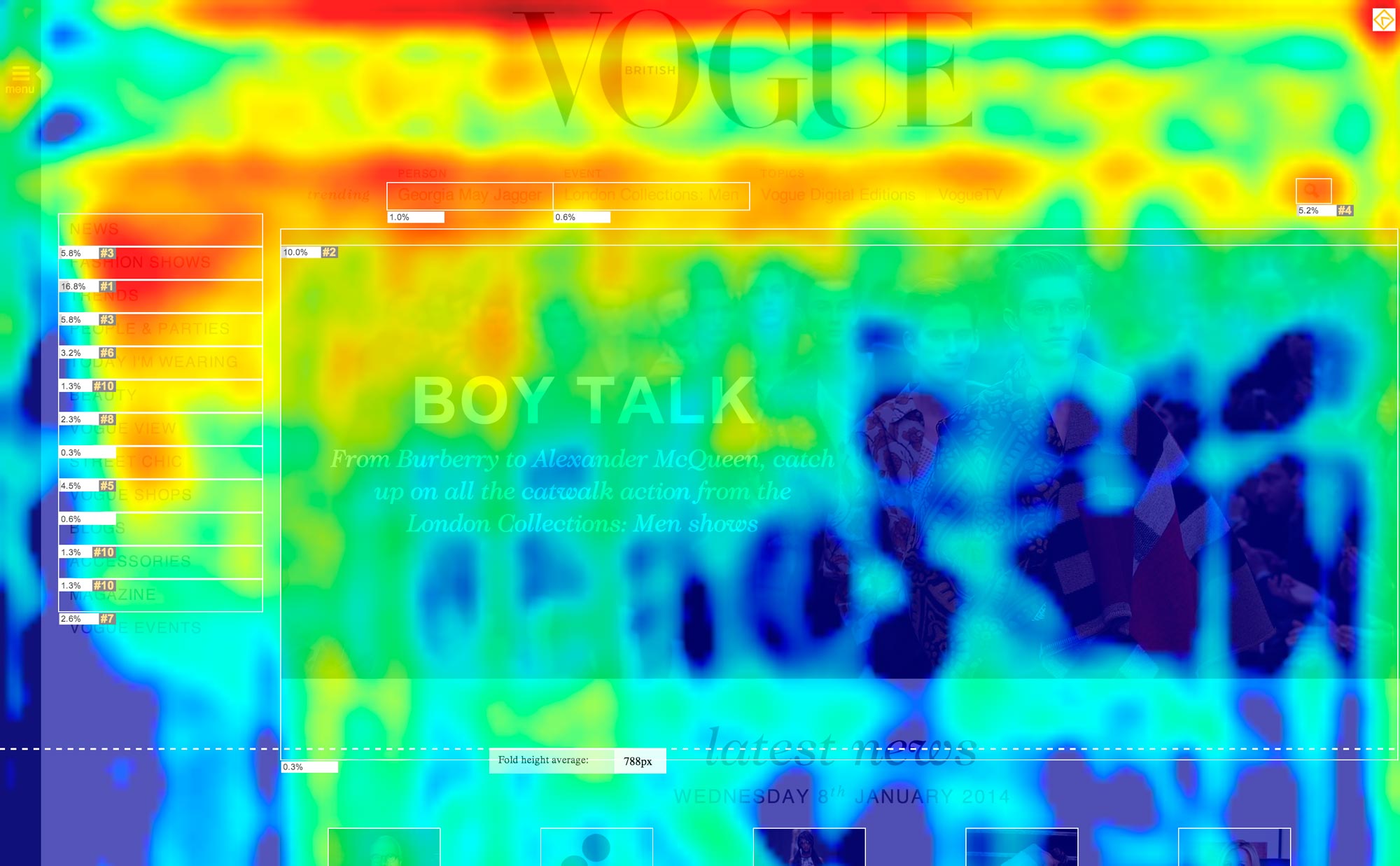
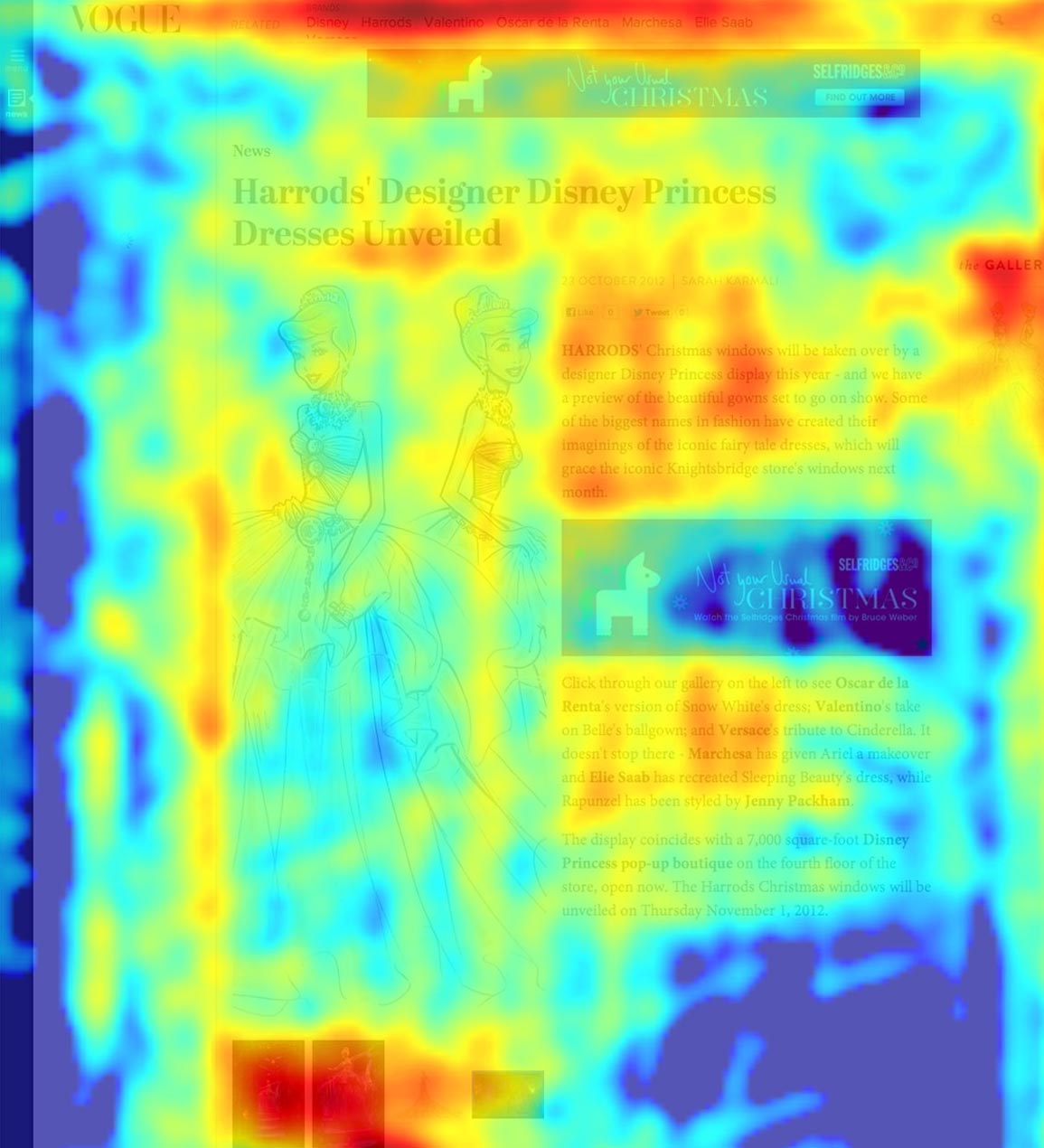
I started the project by exploring the usage of the current Vogue.co.uk through quantitative research. I wanted to gain an understanding of how the site was being used. Which buckets of content was popular, common user journeys, what blocks there were, and what people paid attention to on a page.
Heat maps were a great way to collect this data. I quickly learnt that people were interested in different global elements of a page depending on the type of other content on that page. The heat maps below illustrate that on List pages people were interested in the Navigation; they’re in a choosing mindset. Watching user videos I observed they were clicking through sections, presumably thinking about what to read/see. Whereas on the Article page they are less interested in the Navigation, the article content is what they’re after; they’re in a consuming mindset
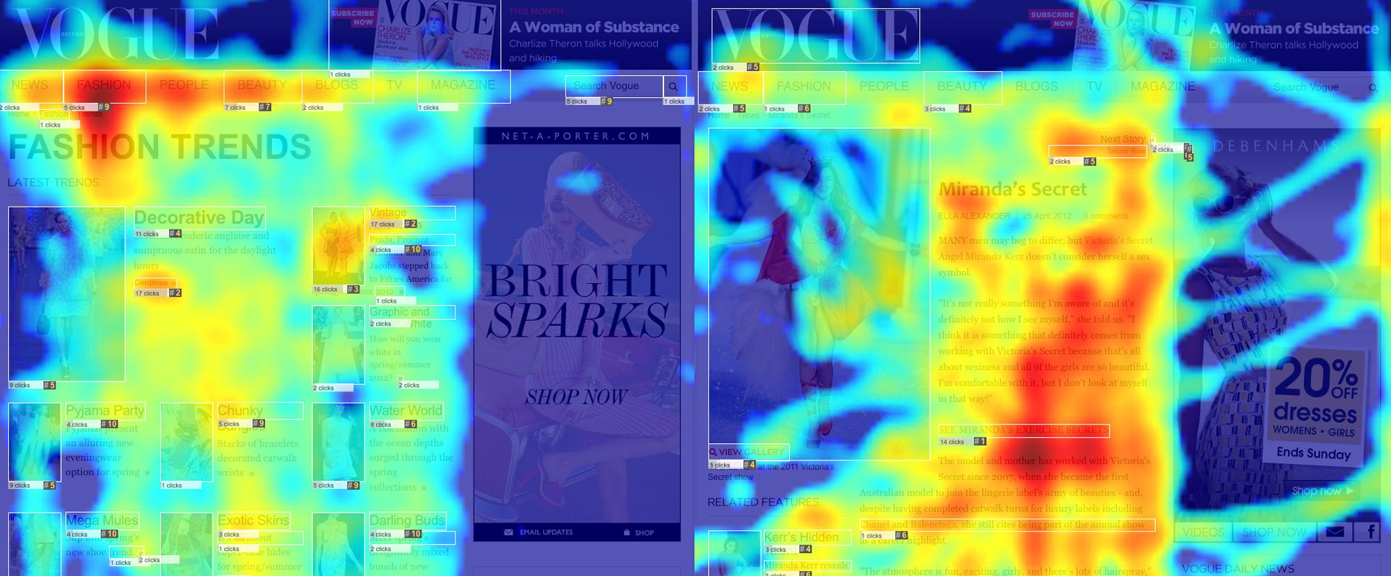 Heatmap of the old Vogue.co.uk List page and Article
There were similar findings when using Google Analytics, looking into users next steps after reading an Article. I found that users next actions were divided into, 34% leaving the site, 20% click on related gallery, 28% click next article, 15% click home. The other 3% covered everything else you could do on that page, which included use the top level navigation.
The top level Navigation was seeing hardly any use on the article pages. Half of the people were going to related content, whether it be a gallery about the article topic or another news item.
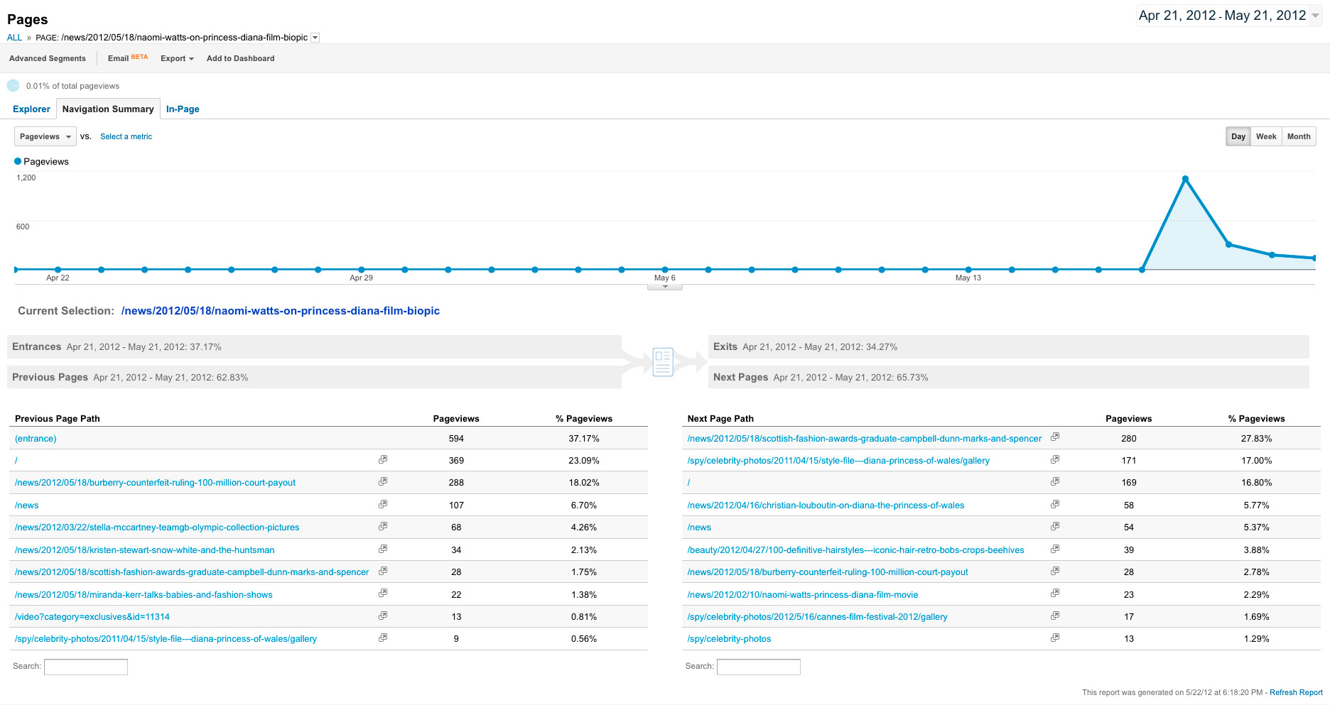 Article next pages from Google Analytics
Further supporting findings about separate choosing and consuming mindsets, heat maps from the Homepage showed more interaction with the top level Navigation. Not surprising, as the Homepage is where you choose what content to read/see.
I also found that people weren’t scrolling down the Homepage very far. They were browsing the latest news then getting stopped by the carousel. People were having little interaction with the page beneath this point.
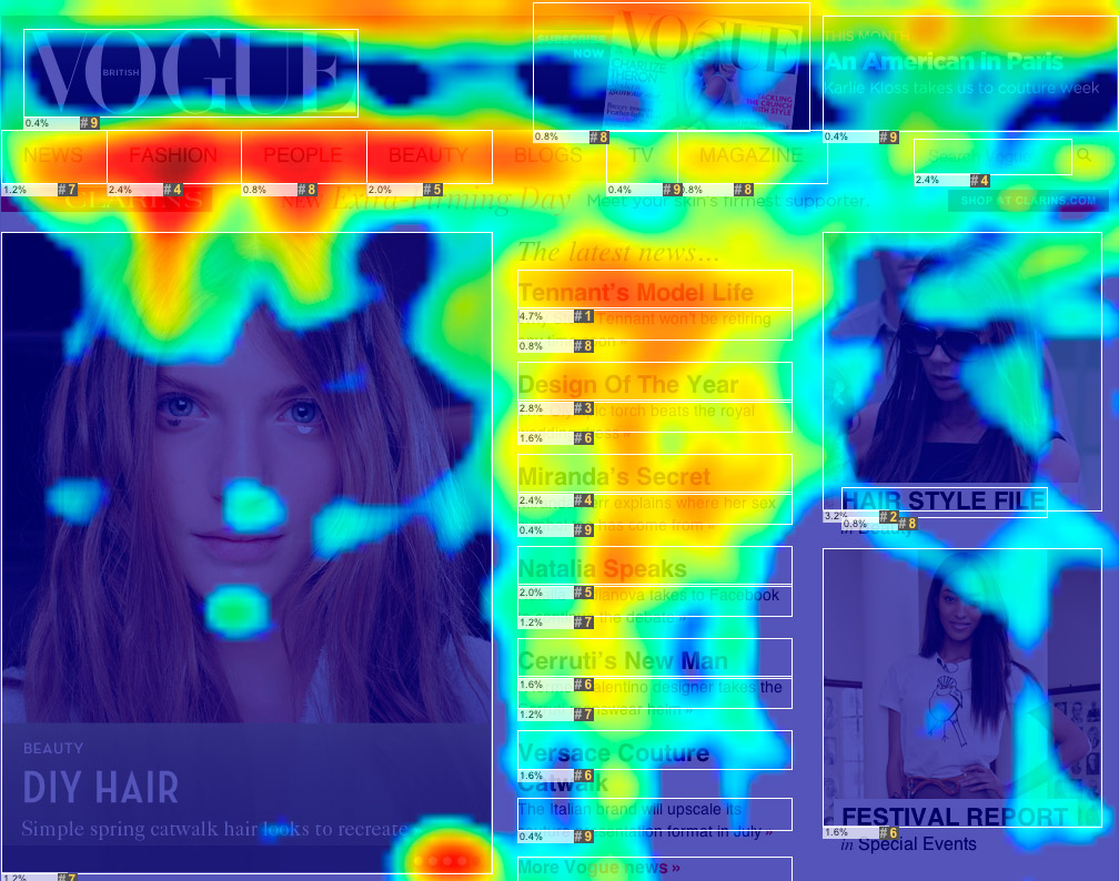 Heatmap of old Vogue.co.uk Home page
Through interviews and creating Personas I found that Vogue has a range of users, each of them with a unique use case. I needed a clear understanding of these users so to cater for them all. The main user groups and their unique aims were,
- Designers: Inspiration from collections
- Editors/Bloggers: See what’s fashionable on the street through Street Chic and latest news
- Students: Research past collections and history of designers
- Buyers: See latest collections and close ups of outfits
- Enthusiasts: See latest news, party photos and latest collections
Problems
The research resulted in a series of questions we needed to answer.
The new homepage had to either have a small amount of content, or how could we design it to encourage scrolling?
Related content is clearly something people interact with, how do we enhance and improve this?
How do we make the cognitive load less when switching from consuming to choosing mindsets?
How do we provide what each person needs without getting in the way of any of them?
Concept
Working collaboratively with the rest of the team, we set about solving these problems.
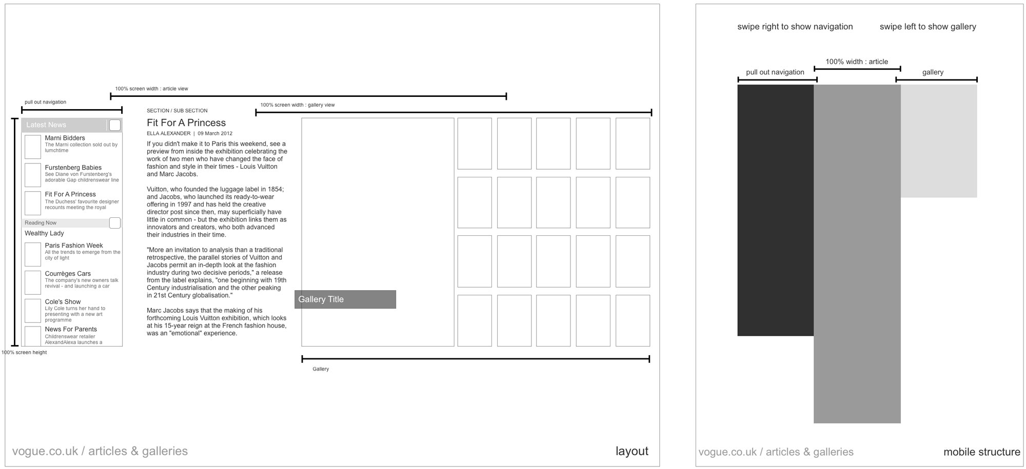
My aim was to remove as much cognitive load as possible in the act of making choices. To achieve this, I wanted people to be able to navigate naturally through content, with the content forming the structure and navigation. This underlining concept gave birth to a range of designs. We experimented with how to produce this concept through Sketches, Wireframes and Prototypes.
 Early wireframes of Article and Gallery and transition between them
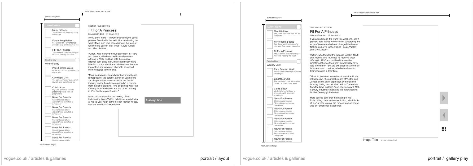
To aid navigation through articles I designed a layout with an article sidebar. The articles in this bar included the article you're currently reading and others from the same section before and after it. If someone comes from a List or Topic page the articles they previously saw on that list would then be in the sidebar. This creates continuity and gives the user a sense of consistency, a versions of the page they were previously on follows them through to the next page.
In an early design I carried this thinking through to the Article and Gallery. The Article would collapse when opening the Gallery, people would know where they came from and how to get back without having to think “where’s the close or back button”. We built and tested prototypes of this, after a while we realised it wasn't performant or usable enough in the browser so had to simplify.
 Early wireframes of the Article and Gallery framework
We built a range of prototypes. The one below is a screenshot of one of them where the Article Navigation collapses when reading the article. When interacting with the Gallery the Article collapsed to just slow a small slice of it.
 Screenshot of an Article and Gallery prototype
Topics
The research showed that after people read an article, they were more likely to click on a related article than go to a section list page. To open up the site, increasing the amount of cross section traffic, it was clear to me I couldn’t rely on just tweaking the top level Navigation. To solve this problem I looked into Topics.
People respond quicker to, and understand easier, words that are currently in their mind. When someone is reading an article about Chanel, they’re more likely to want to read more about Chanel than click on a general section link. This led partly to our decision to hide the Top Level Navigation on article pages, and focus more on Topics.
After getting a data dump of all the topics used on Vogue, I grouped them. I came up with Person, Brand, Event, Place and General Topics. These gave the Topics more context to users, and solved a problem when a Topic could be about two separate things. For example, Victoria Beckham is a Person and also the name of a Brand. Each have different content; one is fashion business and the other is celebrity style.
I wanted Topics to have their own bar permanently on every page. This repetition across the site would help to establish it in peoples minds as a navigation tool.
On the home page, the Topic bar shows Topics of things that have happened recently. When it’s the Grammys it has a Grammys Topic. The Topic page it links to allows the Vogue editors to group multiple articles and galleries on the same Topic, while also opening up access to archival content.
On the Topic page, the topics shown are related topics. For example on the Karl Lagerfeld topic page the related topics are Chanel (whom he designs for) and Coco Chanel. This helps the student and enthusiasts in researching, enabling them to explore Vogues archival content through Topic connections and relationships.

After going through a couple months of iterations I produced the final set of Wireframes. Above is an animation of a Storyboard, using the Wireframes to show a user journey through the new site. This was used to show a user journey through each new template.
Advertising
The Publishing industry was, and still is, facing a big problem with Advertising and Responsive sites. None of the IAB approved Advert formats are Responsive. With a need to make our sites Responsive, we had a challenge figuring how to make standard Ads work in a Responsive environment. Nothing else in our designs had a fixed pixel width. We sketched out each scenario using each device width and each template, to see where the Adverts lived and what worked. We didn’t want the Adverts to be distracting from the content, but they also had to be commercially viable.
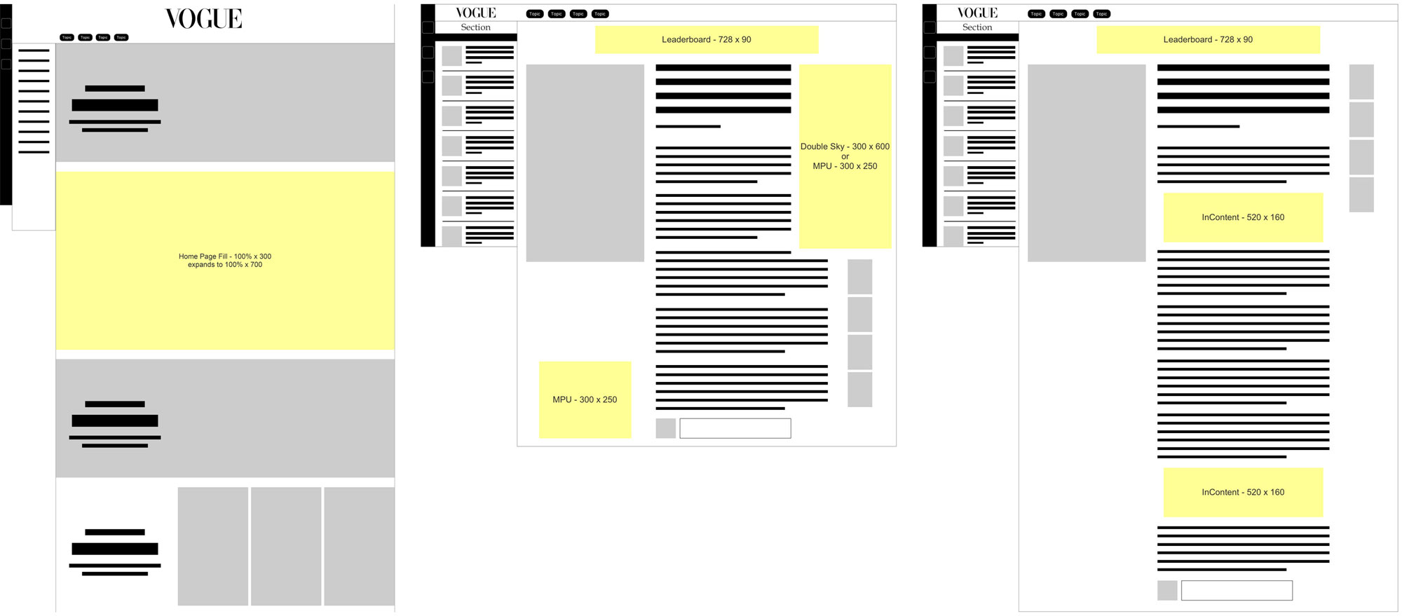 Drawings from the Advertising Specifications showing different formats across Home and Articles
With this project we saw an opportunity to create a new Advertising format for the Responsive web. A few of us in the team got together and asked ourselves, “how could we take the page-spread Adverts seen in the Vogue print magazine and make these work in a Responsive way?” The large format would attract the high end Fashion brands and allow the Adverts to showcase large beautiful photography. We designed a solution that works on the HomePage filling the full width of the page, and in an Article filling up the width of the text area. Our Responsive Adverts are landscape rectangles and expand when clicked, to either show an image or a video.
A Longchamp In-Content Responsive Ad in the Vogue.co.uk news sectionTo make these Responsive we needed each element of the Advert to be separate. With this we could resize the logo independently to the Advert size, making it readable on small screens. A typical Advert life cycle from Brand to Publisher is long and arduous, going through Ad Buyers, Design Agencies, Sales and Ad Ops teams. For brands to use our new format we needed to provide a simple way for them to use their current assets.
Responsive Ad Builder
We built a Responsive Ad Builder! The Brand or their Design Agency uploads a series of images, a logo and an optional video. They can rearrange these elements and then preview the Advert on the Vogue.co.uk HomePage and Articles.
Rearranging and resizing background and logo, changes for all ad sizes Checking the layout at varying screen sizes, you can move assets around independently for smaller screens Previewing the ad you've built on the Vogue Homepage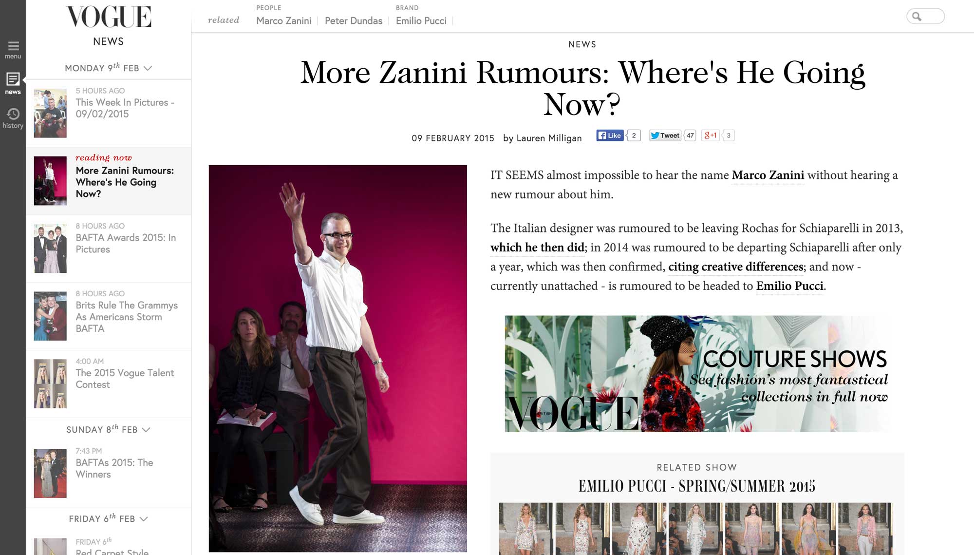 Screenshot of an article on the live Vogue.co.uk. Visual design by Kat Windley
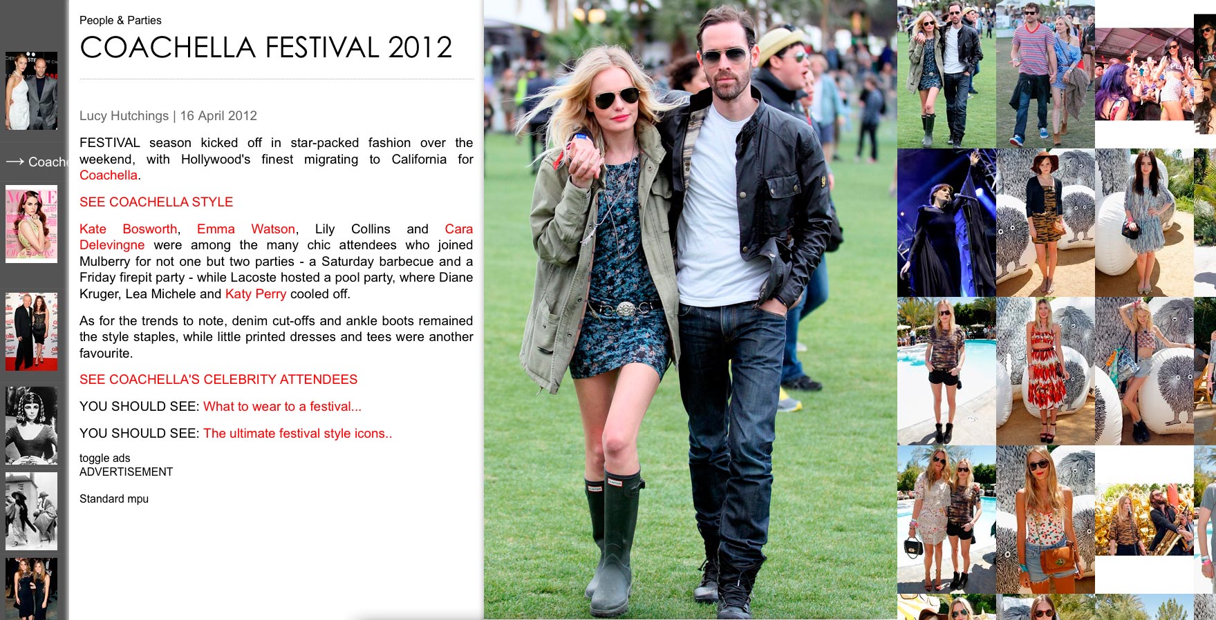
Results
Once the launch of the new site had settled we saw some notable improvements,
- Pages Per View went up from 10 to 11.
- Time spent on page went up from 22 to 28seconds. Before the launch Vogue.co.uk was seeing a downward trend in the time spent on page.
- Traffic was more evenly spread out through sections. Sections that weren’t getting much exposure before increased their page view share. For example, Accessories was 0.26%, then increased to 4.95% page view share.
- New In-Content ads were a big success. Most of the high end fashion brands, such as Chanel, Burberry and Ralph Lauren, produced and bought our Responsive Ads.
 Heatmap showing usage of the new Vogue.co.uk Homepage
 Heatmap showing usage of the new Vogue.co.uk Article
What I learnt
This was a mammoth project! As a team we learnt not to try tackling a whole site in one go again. In future projects we broke a site down and split it into separate projects. This made it a lot calmer and easier to manage.
The design was fairly complex in its implementation, this caused us to release with quite a few bugs and with some features not fully coded. This taught me how important it is to find that balance between new methods of interaction and development simplicity.
This project received a lot more involvement from the print magazine side of the brand, than the other brands sites I worked on at Condé Nast. It was tricky at first as we both had very different views to how Vogue should work in the digital world. I learnt to work together and take on board their knowledge and insight from living with the brand for so many years.
Peoples Reactions
On the afternoon we launched, we saw a couple people Tweet about the new look Vogue.co.uk. After a while this grew to hundreds of people talking about the new site. The majority were super positive and loving the new site! Others pointed out bugs we prioritised to get fixed. It was the first time any of us in the team had seen such a reaction to something we’d built. It was great to see this instant reaction.
Look at our beautiful new site http://t.co/5MvhiXpS Enjoy!! @BritishVogue #proud pic.twitter.com/2YENCRYK
— CALGARY AVANSINO (@calgaryavansino) August 30, 2012
I LOVE the new @BritishVogue website. Very nice indeed: http://t.co/WrjaihRM
— Natasha Dallyn (@Natasha_Dallyn) August 30, 2012
Very impressive - responsive design and gorgeous web fonts RT @BenHobson: Everyone check the relaunched Vogue site - http://t.co/80N0X1ZE
— Barry Frost (@barryf) August 30, 2012
OMG!!!! @BritishVogue made a GREAT JOB!!!!!!!!!!!!!!! Guys you definitely SHOULD visit their website!
— • Veronika • (@ImThatLiar) August 30, 2012
New @BritishVogue website looks amazing.
— Emily Norval (@emnorv) August 30, 2012
check out the lovely, clean new site @BritishVogue
http://t.co/rZssLndG
— jo ellison (@jellison) August 30, 2012
The new look http://t.co/6mItPg2r website is very different from other online publishers. Great work @BritishVogue.
— Michael Jarrett (@fullvisual) August 30, 2012
The new Vogue website is delicious! The navigation is amazing! Only looked at it for 5 mins & fell head over heels.
http://t.co/ToByInaI
— TJ Anderson (@taraja_or_tj) August 30, 2012
@BritishVogue FINALLY a fashion magazine website that is as chic as its published counterpart!
— Alena Walker (@alenajwalker) August 30, 2012
Lost in the world of @BritishVogue and their newly redesigned website...it's fabulous!
— Emma (@artymiss) August 30, 2012
Freaking out over the new http://t.co/1LDZ0Hhj. Brilliant.
— Rachel Walgrove (@RachelWalgrove) August 30, 2012
by Gareth Williams
I pride myself on empowering teams to turn complex problems into simple and engaging experiences, through a multidisciplinary skill set and 10+ years of industry experience. If you'd like to chat please get in touch.